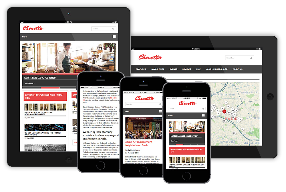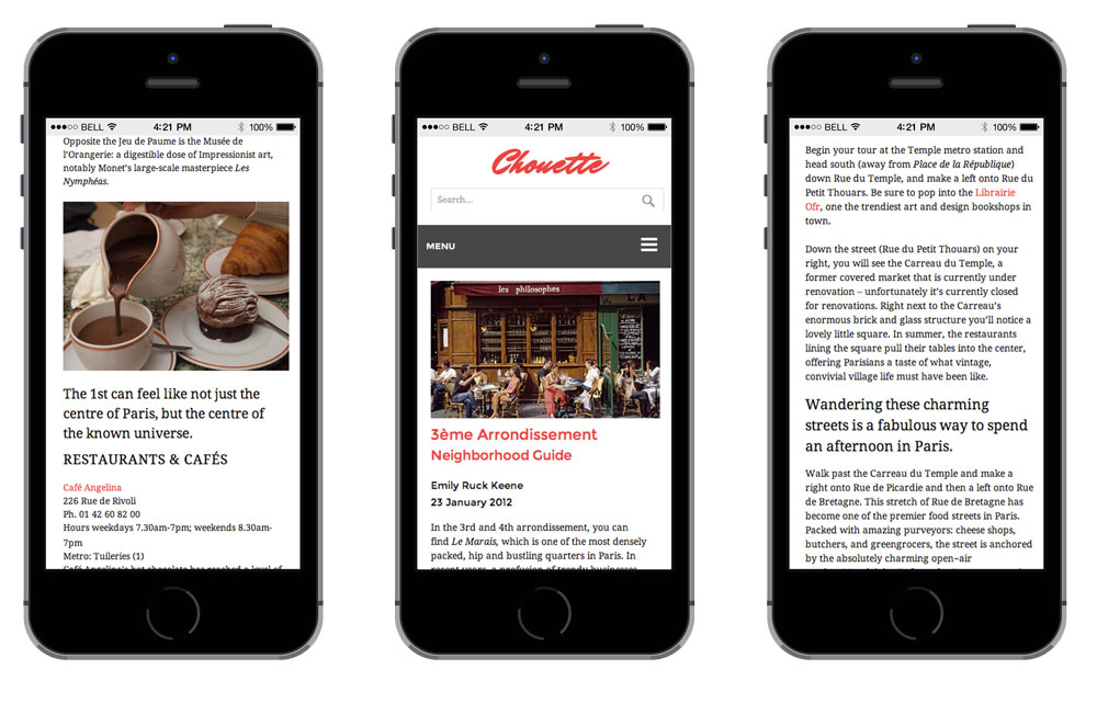


Chouette is an online publication for English speaking ex–patriots living in Paris, France. It is intended for the mobile platform, providing an interactive experience of the City of Light.
PROBLEM: Online magazines are losing their readers due to a lack of ease in the readability of articles. Advertising is often overly obtrusive for readers, but it’s required to keep the publication in business.
SOLUTION: Creating variations in the article styling and custom post templates within a WordPress framework keeps the reader visually engaged through the length of the article. Native advertising provides readers with content specific ads and marketers a more direct route to potential buyers.


OFFICE NOMADS is a Seattle co-working space that needed a signage and way-finding system, as well as a rebrand. The most important areas for signage were determined by a circulation study focused on the main entry, where people who are new to the space arrive from. A necessary convenience of this co-working space is knowing who is present in the building, and for newcomers to know where all the work spaces are located. We created a member info board with name plates and location sliders to remedy this in a way that fit the aesthetic of the brand we were forming.
The Office Nomad brand focuses on community and hard work, so we forged an identity for them rooted in viking culture. This helped focus our material choices to natural materials; copper, brick, wood and paint. For the many nomads who come and go, the secondary entrance is lit with a beautiful hand-painted quote which stirs perseverance and optimism. We developed a user-focused way-finding system using natural materials that take advantage of this beautiful historic building. Partners: Matthew Sherman, Brendan Dunn


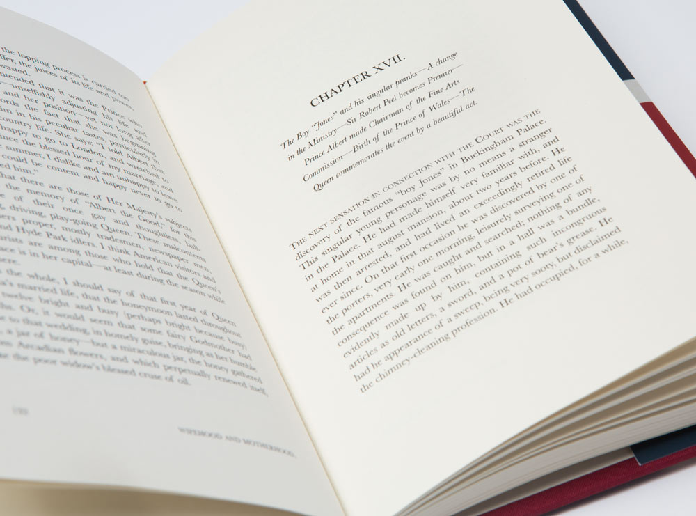
First published in 1884, this endearing biography of Queen Victoria was my subject for this book layout and cover redesign. I photo directed the cover shot of the Queen and wrapped it within an image of the British flag, only allowing certain features to show.
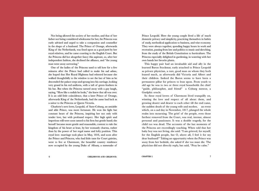
This portrays the idea of the biography as only a glimpse into her life. I chose Baskerville as the typeface throughout the entire layout and to justify the text, both evoking the time period in which the book was written.


