
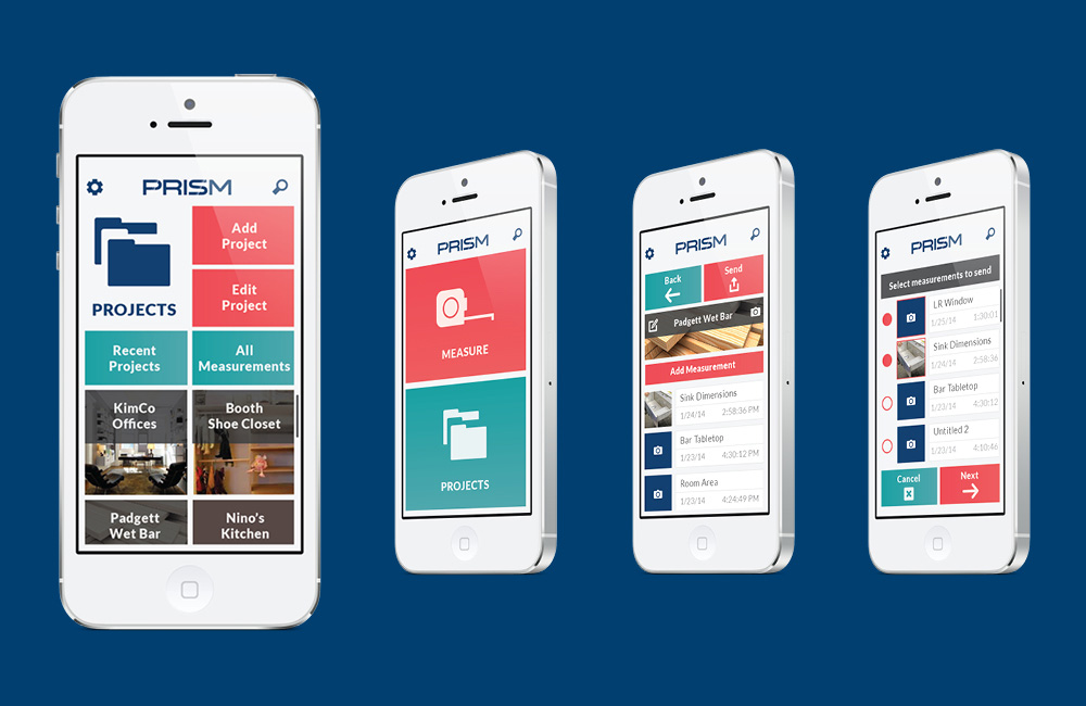
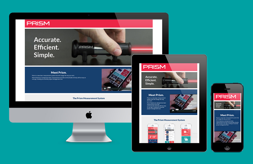
Prism was a collaborative project with fellow designers Kimberly Jacobs and Nino Mascorella. We created an app that worked in conjunction with a connected laser measurement device to record measurements directly to the app where the data could then be exported easily.
Multiple rounds of user testing with members of our primary target market (contractors) proved to be invaluable in helping us create a straightforward, user friendly app and device. In addition to the app and device prototypes, we created a marketing strategy, designed packaging and built a landing page website.
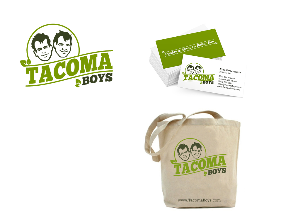
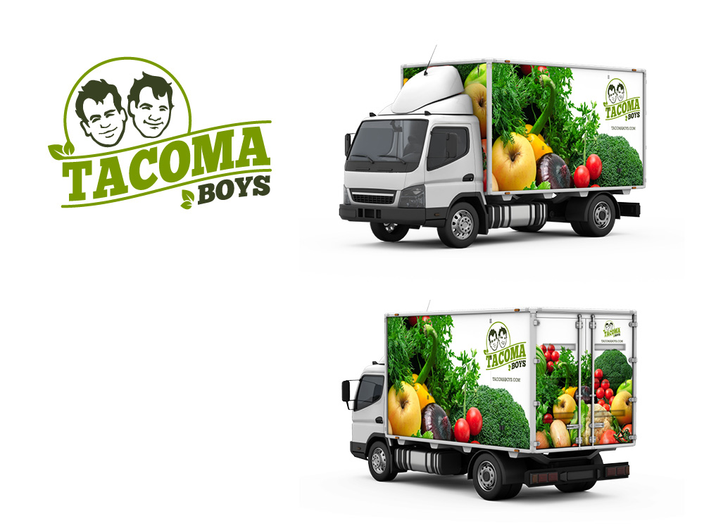
Tacoma Boys is a small chain of fresh produce and gourmet foods markets in the South Sound area. The unique character of the markets themselves served as great inspiration for creating a logo that was quirky and friendly. When redesigning the branding and identity for Tacoma Boys, balancing the fun attitude of the company with the required professionalism of a business was an interesting problem to solve.
In addition to the logo, the project included a 12-page graphic standards manual, business cards and stationery suite, company products and promotional and marketing materials.
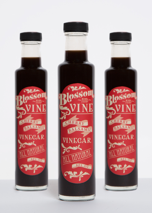
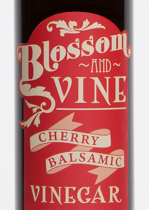
The labeling for this Cherry Balsamic Vinegar was inspired by Victorian design, allowing the packaging to recall a time when products were hand made with care. That speaks to the hand-crafted, artisanal nature of the vinegar.
The color palette of light red-orange and warm ivory was inspired by ripe Rainier cherries, though the label was specifically designed to be easily modifiable for different flavored vinegars by changing the color palette. A fun challenge of the design was working with such a variety of typefaces.


