 [/full_width]
[full_width]
 [/full_width]
[one_half]
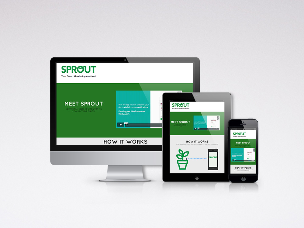
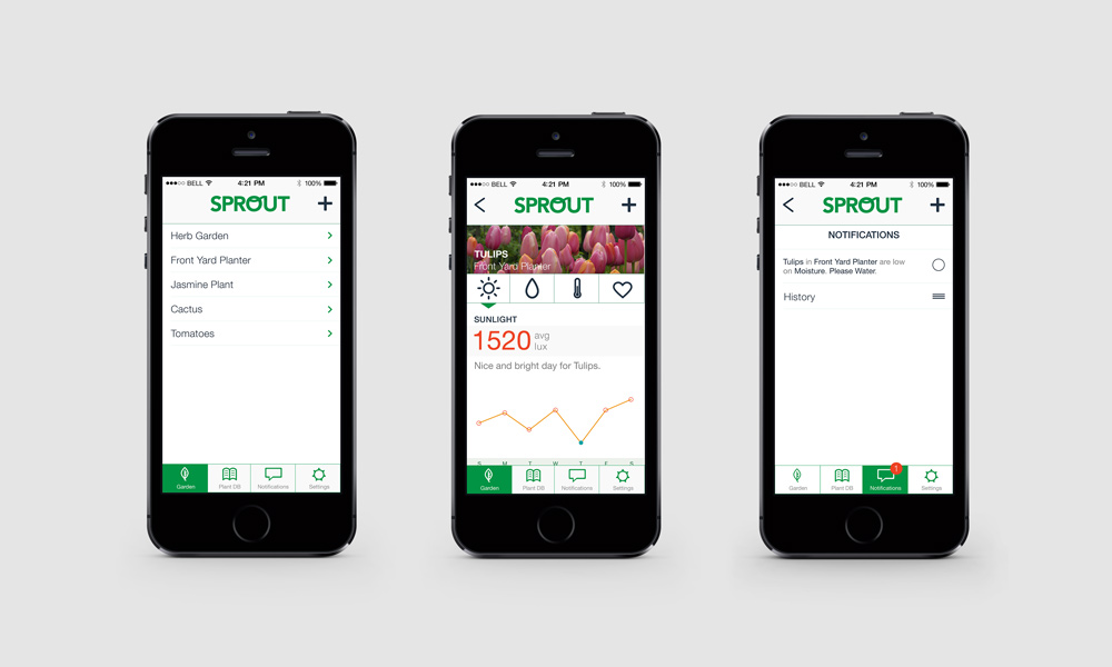
The goal of the Sprout app is to create an experience that allows users to monitor and interact with their garden and individual plants via hardware and a mobile device. Sprout acts as a smart gardening assistant that helps the novice gardener by notifying them when their plant vitals are dangerously low.
[/one_half] [one_half_last] It is also useful for the more advanced gardener as collected data on vitals can be viewed in detail and analyzed to forecast ahead. Sprout is a partnered project between Van Nguyen and Alex Sivilay. [/one_half_last] [/full_width]
[full_width]
 [/full_width]
[one_half]
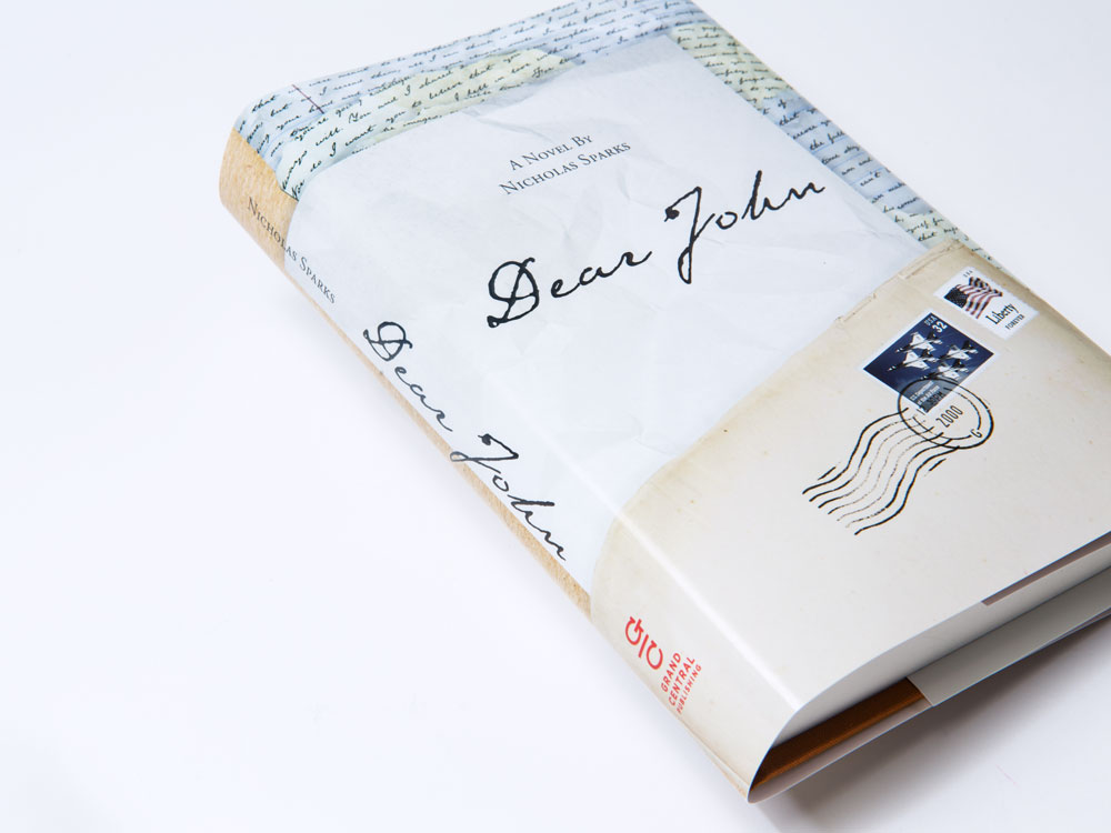
A redesign of one of my favorite books, "Dear John", a novel by Nicholas Sparks. To capture and interpret the bittersweet love story throughout the novel, I used old-fashion handwritten letters. To do this, I typed the letters and baked them in the oven. Once the heat made them look old, I photographed them and used them for the dust jacket.
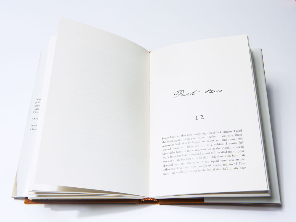
[/one_half] [one_half_last] I also focused on the interior typography, layout and spacing details. I added room to the edges so the readers could comfortably hold the book without covering the text. To provide a pleasant reading experience, I chose Garamond typeface. [/one_half_last] [/full_width]
[one_half]
The logo redesign for Pike Place Fish Market is a modern, simple, iconic and recognizable approach using brandmark symbol. The concept was to appeal to larger and wider audience, while maintaining their identity as a reliable source for news and strong innovation, as well as develop their "World Famous" business.
[/one_half] [one_half_last] The look of logo reveals the best quality of fish of the company is referenced by a deep blue sapphire Pantone color and a customized version of the classic typeface Avenir Next. [/one_half_last]