 [/full_width]
[full_width]
 [/full_width]
[one_half]
The Crows Nest application would be a direct link between the onboard functions and status of a marine craft and it's operator. Whether that operator be a skipper, vessel owner or marine surveyor. He or she will have at the tip of their fingers the priority functions of the ship displayed in realtime via this app. Such functions would be; Knots/Depth, Windspeed & Direction, AIS (Automated Identification System), GPS, Fleet, Alarms and of course Security systems. These various on board systems are already being collated, its only a matter of transmitting the information to the application. Crows Nest is formatted on the card shuffle system, which means each app function would have a complete, concise and clear display that is immediately digestible. Most importantly Crows Nest has real world application for small and medium sized vessels, commercial and surveying purposes. Allowing for a constant on-hand knowledge of the marine craft and it's operations.
[/one_half]
[one_half_last]
The Transmyt application has tremendous potential and important functions that could revolutionize the way individuals live with type one and type two diabetes. Inspired by a prevalent demand for immediate information and regulation of an individual's daily dietary habits in conjunction with monitoring their diabetes. This application is profound in it's scope and comprehension of the day to day necessity for monitoring the caloric intake of someone living with diabetes. The three primary functions of Transmyt is dietary, monitoring and overall trends. The dietary function allows a person to impute the caloric value of the food they're eating. The monitoring function is for family and trusted friends who desire a direct link to a dependent with diabetes. The trends function allows the user to see where she or he is with managing their diabetes on a daily basis. A1C, custom trends and daily trends are all included, relaying dietary habits and the Transmyt sensor information feed backs. This application speaks for itself in allowing for an individual's increased ability to manage their diabetes.
[/one_half_last]
  [/one_half]
[one_half_last]
 [/one_half_last]
[one_half]
Above is a sampling of some of the posters that were created over the course of this graphic design program. The first poster was selected to properly represent my comprehension and abilities as and illustrator. The posters theme was Duo and for that I immediately latched onto the inspiration derived from the music that I'd happened to be listening to at the time the assignment was given; Prince. Sure Prince is recognized as a solo artist and for that odd period in the 1990's just as a symbol but don't disregard the contributions made by his most important of bands; The Revolution. So like some of the best scenes out of Purple Rain I made the creative decision to pair up Prince with Wendy but rather than give her her standard guitar, a keytar instead. Whats more 80's than a keytar? Inspired by music illustrators like Peter Max, I choose to creatively deform and distort the characters and include a forced perspective drawing the eye up following the trio of saturated hues. At the bottom is the typographic juxtopsition of a whispered “duet” to Prince and Wendy overly animated belting into the microphone. The physical posters were created by a three color silkscreen process on a thick ply paper stock.
[/one_half]
[one_half_last]
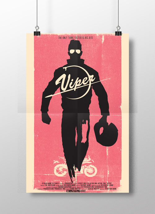
The second poster was created as part of a marketing project in order to promote a fictitious film of our own creation. The catch being that we had to pretend to be the art director of this promotional project and only duplicate the style of an illustrator as if we had hired him or her. I was on a recent 80's action film bender and in this case I found the two tone illustrations styles of Rusty Charles an appropriate match. So having established the visual style and film title; Viper, a series of roughs, three comps and eventually a final poster.
[/one_half_last]
[/one_half_last]
[one_half]
Above is a sampling of some of the posters that were created over the course of this graphic design program. The first poster was selected to properly represent my comprehension and abilities as and illustrator. The posters theme was Duo and for that I immediately latched onto the inspiration derived from the music that I'd happened to be listening to at the time the assignment was given; Prince. Sure Prince is recognized as a solo artist and for that odd period in the 1990's just as a symbol but don't disregard the contributions made by his most important of bands; The Revolution. So like some of the best scenes out of Purple Rain I made the creative decision to pair up Prince with Wendy but rather than give her her standard guitar, a keytar instead. Whats more 80's than a keytar? Inspired by music illustrators like Peter Max, I choose to creatively deform and distort the characters and include a forced perspective drawing the eye up following the trio of saturated hues. At the bottom is the typographic juxtopsition of a whispered “duet” to Prince and Wendy overly animated belting into the microphone. The physical posters were created by a three color silkscreen process on a thick ply paper stock.
[/one_half]
[one_half_last]
The second poster was created as part of a marketing project in order to promote a fictitious film of our own creation. The catch being that we had to pretend to be the art director of this promotional project and only duplicate the style of an illustrator as if we had hired him or her. I was on a recent 80's action film bender and in this case I found the two tone illustrations styles of Rusty Charles an appropriate match. So having established the visual style and film title; Viper, a series of roughs, three comps and eventually a final poster.
[/one_half_last]  [/full_width]
[one_half]
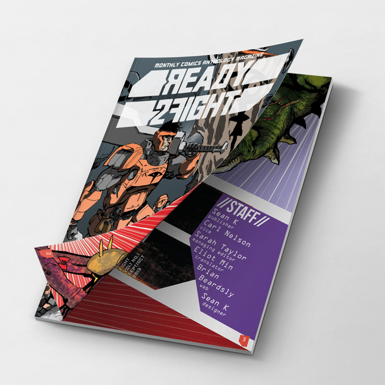
The magazine assignment was a critical print piece that was a demanding yet rewarding experience in developing a well designed and comprehensive publication. Going into this project I knew I wanted to carry on the adult comics traditions of Metal Hurlant, 2000 AD and Eclipse but with a focus on budding Northwest comic book talent. Having worked in the comic books industry for almost a decade I knew what I wanted from the magazine but translating that vision to print was another issue entirely. I resourced number of incredible local talents who were more than happy to provide content for the magazine. Ready 2 Fight was originally a zine that was inspired by a late night encounter with a ruffian who was about to bum-rush a nightclub (I use nightclub loosely) after having been summarily evicted only moments earlier. The thematic elements of the magazine existed in the realms of fantasy and science fiction, the two required criteria's for any submitted comic. Terrific talent was featured in Ready 2 Fight; Carl Nelson, Sarah Taylor and a local up and comer Eliot Min whose title 1BDP was a smash hit at Emerald City Comic Con.
[/one_half]
[one_half_last]
I provided the additional content such as cover, table of contents and a brief interview article with Moebius which reproduced from and older Metal Hurlant. In order to create a distinct thematic impression on the reader the pages would have a ruined and faded background texture added to reinforce the image of this magazine being a science fiction artifact. Eliot Min contributed an awesome centerfold poster image that can be removed from the magazine and displayed. A promotional piece that I'd like to see utilized in more comics magazines is the inclusion of a promo mini comic. This comic would feature a creator from a more independent spectrum of sci-fi and fantasy genre and would create a sense of awareness and collectibility around the creator's work. I'd like to think that the majority of these goals were successful in Ready 2 Fight.
[/one_half_last]