

For this project I was given a set of guidelines and a team of three classmates to help me create images worthy of going into a magazine or catalog. My art director gave me a product brand, some examples of imagery he liked, and a final number of images to create. My assistant and digital tech then helped me execute the
photos on the day of the shoot. Being given strict guidelines was something I wasn’t used to. Despite being apprehensive about the project, I ended up with some of the best images I’ve ever created. The images are bright, clean, and have a nice pop of color. It has inspired me to take a similar approach to other assignments.

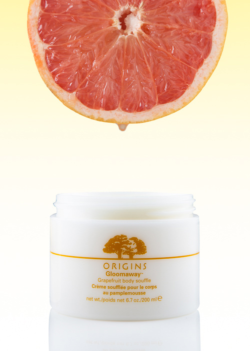
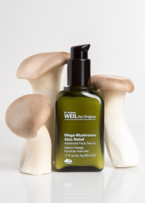
I like to incorporate ingredients from products into my images. It adds life and helps tell a story about the product. It can also add color and texture, which adds more visual interest to the image. Colorful products and images are often what inspire me.
I like to pick products that have a special ingredient that’s featured in the product’s description. If there isn’t a specific ingredient I want to include, I’ll pick an item that fits the season or setting where the product would be found.
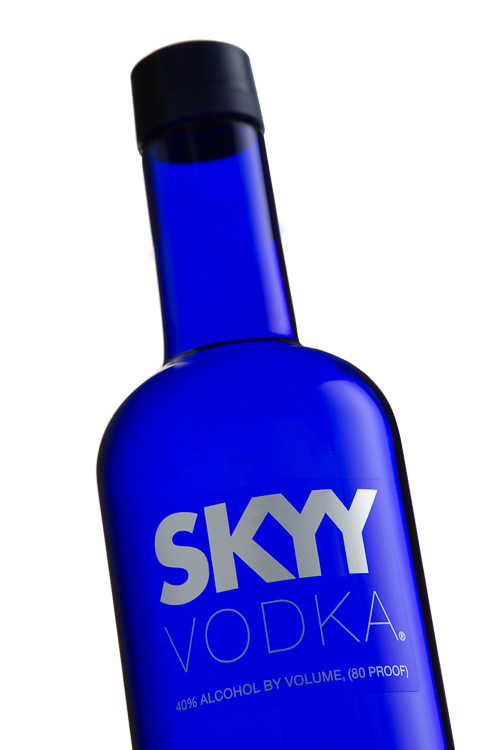
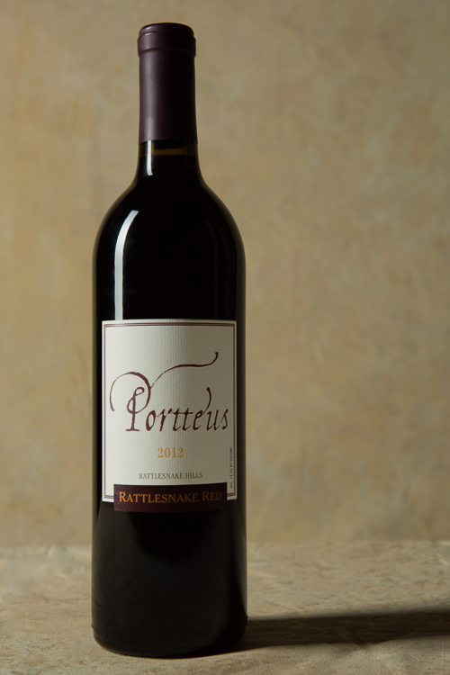
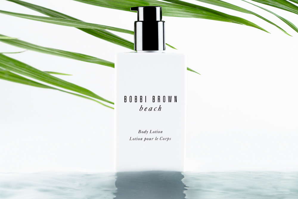
While I like supplementing my products with accents of their ingredients, I also like creating clean images of products on their own. It allows the viewer to focus on just the product itself without any distractions. As in the wine image, I like to create
backgrounds that are appropriate for the product. I look forward to taking that kind of work out of the studio and on location where I can create more realistic backgrounds. I like creating the kind of work that could be found in a magazine or catalog.


