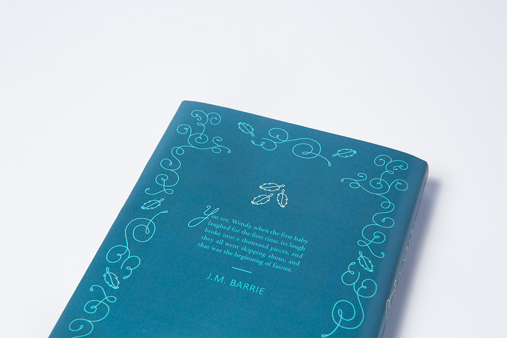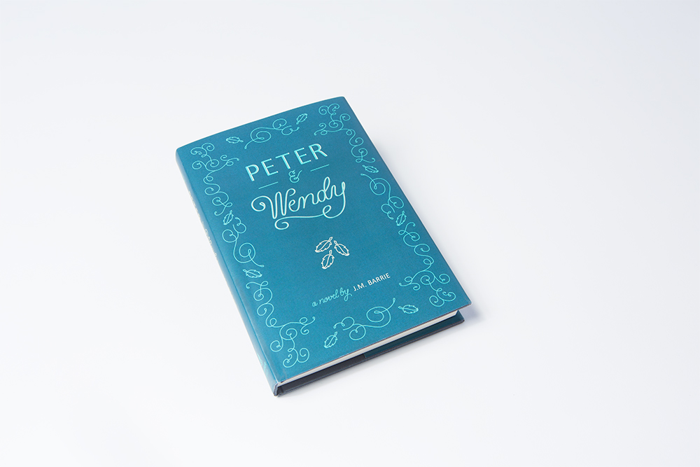
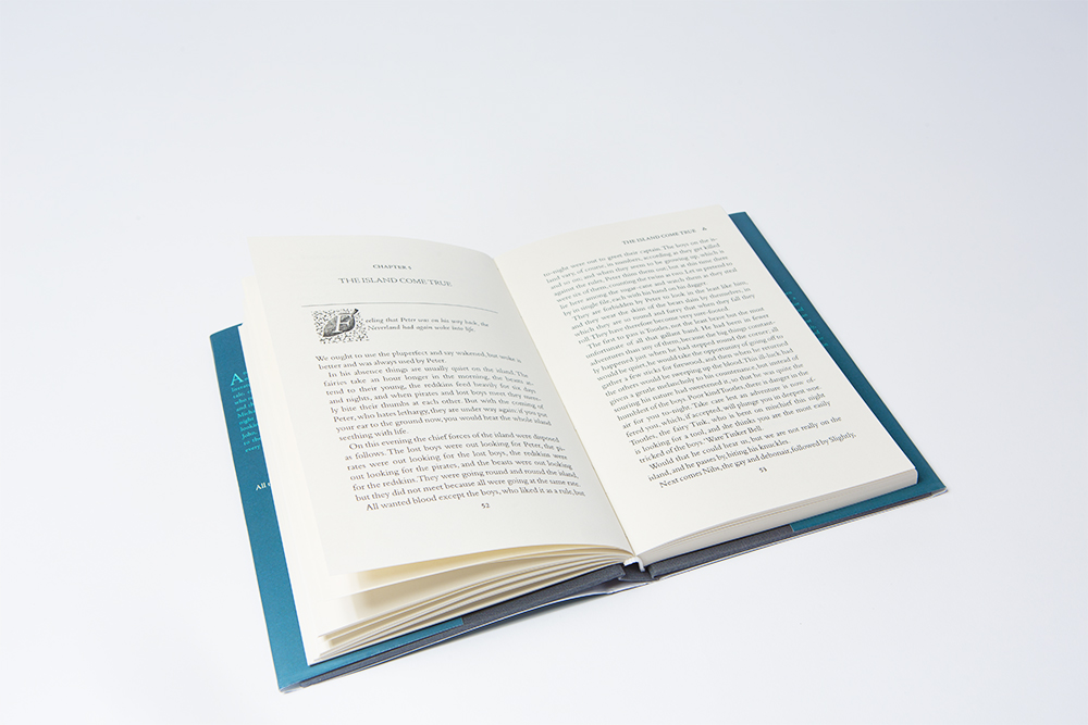
The story of Peter Pan by J.M. Barrie has been a timeless classic since its debut on a London stage in 1904. In 1911, the book was first entitled PETER & WENDY and therefore, I used this as a means to recreate a story that could reach a larger and perhaps older audience. Resurrecting the title PETER & WENDY allowed for a softer and elegant design approach as well as shining a light on the dynamic relationship between these two characters throughout the story.
The three leaves represent the uncertainty of Peter Pan’s existence (make-believe) a common theme throughout the book, in which three leaves were first found under the windowsill in the nursery. The cover was set in san serif Calibri and the serif typeface Adobe Jenson while implementing hand lettering and illustration for the rest.
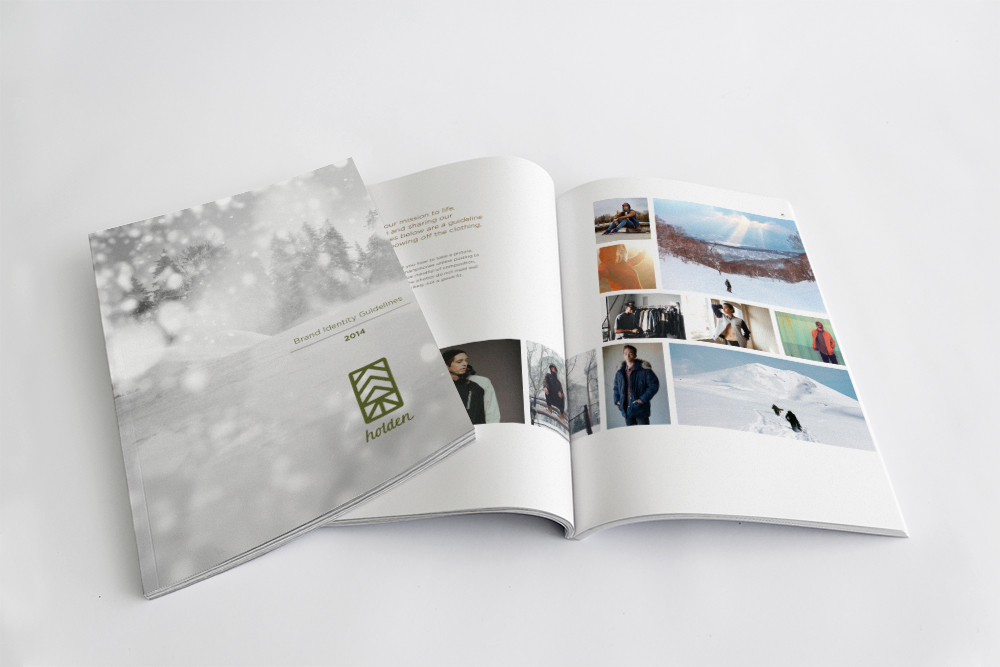

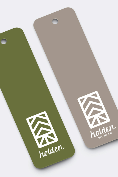
Holden Outerwear is a clothing manufacturing company for skiing and snowboarding. Since Holden Outerwear was purchased in December, 2013 by Pow Inc. in Seattle, Washington it has gained new resources that will increase brand exposure, therefore a perfect candidate for a brand identity redesign. The Holden brand strives for the apparel to be a leader in design and functionality.
I wanted to highlight this look with a fresher, more sophisticated appeal. The logo was constructed in an abstract form of mountains and trees with a hand-lettered logotype. Keeping recognizable elements from the original script logo makes it more gender neutral. The result was a logo with a sense of empowerment and class.
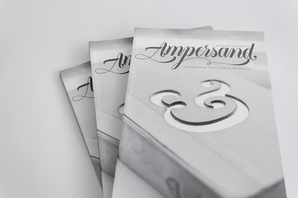
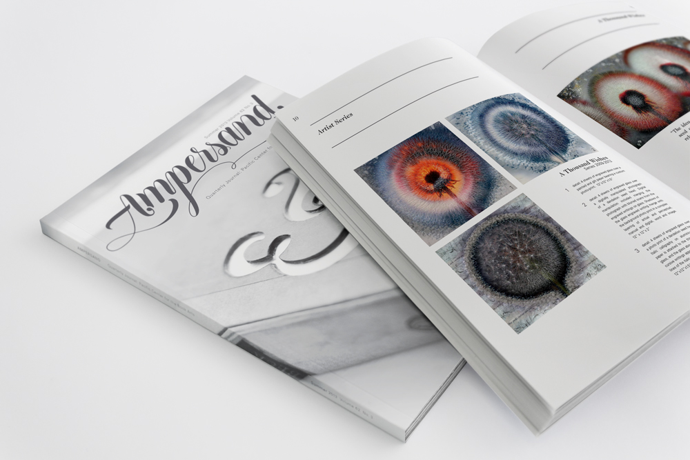
The Center for the Book Arts in San Francisco has provided readers with a quarterly journal that highlighted the art form’s most talented artists, their works, and valuable techniques and tutorials for years, however no longer in print. As a revival assignment, I was tasked to create a publication that could be resurrected from the ashes of its original predecessor with a new design that embodied the book arts as well as incorporating my own hand-lettered style.
The new look needed a sense of perseverance, elegance, trendiness, and promotion. The Ampersand logotype was hand lettered while the cover photography was shot by Karen Obrist Photography of an “&” symbols laser cut into the book.