 [/full_width]
[full_width]
[/full_width]
[full_width]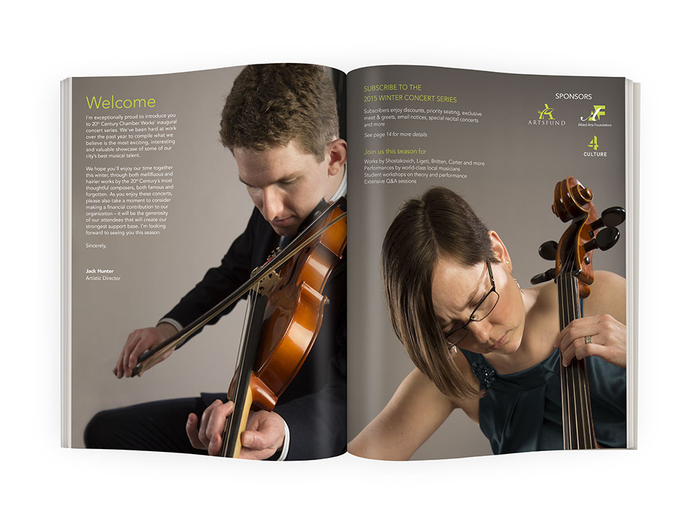 [/full_width]
[full_width]
[/full_width]
[full_width]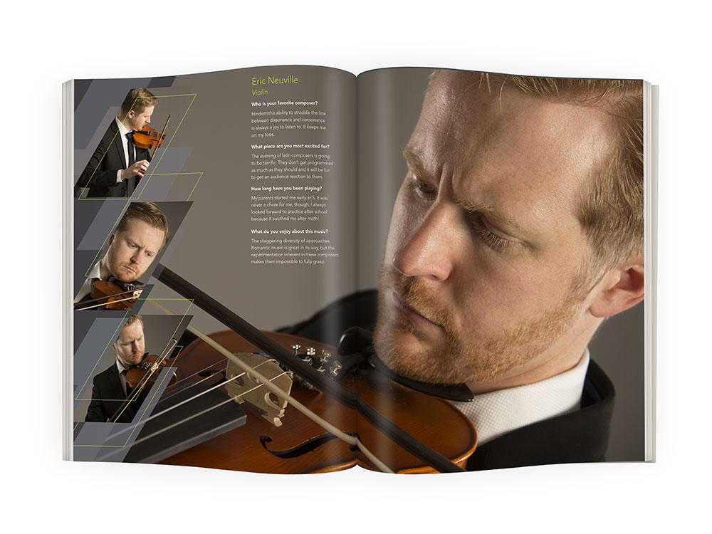 [/full_width]
[one_half]
[/full_width]
[one_half]
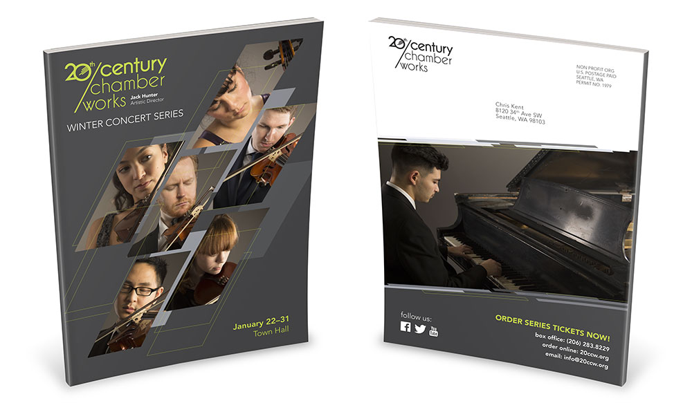
This was a particularly engaging chance to design branding and collateral for a chamber music organization. This 16-page program is part of a much larger package including stationery, tickets, appeal brochure with remittance envelope, concert poster and responsive website. I used a theme of skewed rectangles and layered planes as a visual portrayal of the dissonant and sometimes harsh nature of classical music from the 20th century.
[/one_half]
[one_half_last] The photographic style (shot by Sarah Carson), was informed by research that suggested strongly that patrons and concertgoers attend performances as much for the musicians as for the pieces being played. Thus, I wanted to show a lot of personality and intensity by cropping the shots quite close. [/one_half_last]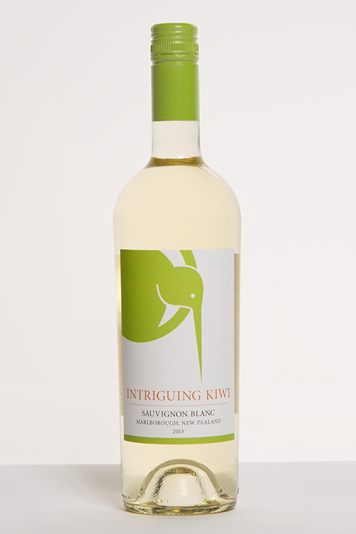 [/one_half]
[one_half]
[/one_half]
[one_half]
Sauvignon Blanc is the most popular wine to come from New Zealand. Its crisp and refreshing nature is a heavy competitor for Australia's oily Chardonnays, which is causing a lot of contention between the two markets. I wanted to create a label for a New Zealand wine that could be clean and hit that sweet spot price point of Australian wines (about $10-$15).
[/one_half]
[one_half_last]
New Zealanders are called Kiwis after the flightless bird that is native to the islands. When creating the name, I wanted to find something that would describe the wine, have a lot of consonance in the vowel sounds to make it catchy, and tie it strongly to the nation of its creation. The emblem is a stylized kiwi bird in a circle, colored in a bright yellow-green in order that the consumer associate the crisp flavor with the crisp color.
[/one_half_last]
 [/one_half]
[one_half_last]
[/one_half]
[one_half_last]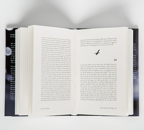 [/one_half_last]
[one_half]
[/one_half_last]
[one_half]
One of my favorite projects from this program, creating an entire book was challenging and enjoyable. I chose J.D. Salinger's The Catcher in the Rye, mainly for the difficulty of laying out such a dialogue-heavy book. I am aware that the book is highly personal for many people, and those people do not want to be influenced on the look of the characters or places by the cover.
[/one_half]
[one_half_last]With that in mind, I commissioned Elizabeth Ogle to shoot a blurred out city at night, reflecting the protagonist's drunken and indecisive mindset throughout the story. I also had a lot of fun with the interior. The end sheets are a red plaid, a reference to the protagonist's hunting cap. I used silhouettes of ducks as the end of chapter markers, recalling a central focus of the book.
[/one_half_last]